Justin

Week 9 2026: VR Image Gallery

Accomplishments Minor UX improvements and Bugfixes Research Video Playback Challenges Paginated VR Grid Menu Bonus Thumbnail Update Tool To continue improving the user experience (UX) for viewers in virtual reality (VR) I decided to create a 3D version of the image gallery menu designed in Week 2. A gallery menu option allows viewers to select the exact scene they want to view in the fewest clicks. This greatly reduces the friction when navigating dense tours or sporadic image galleries. Through this implementation, I identified edge cases affecting the existing vr menus. This includes an issue that relies on the video playback process and requires more investigation. As a bonus, I was able to produce a tool for editing the panorama thumbnails that appear in the custom grid view to allow for optional adjustments. Minor UX improvements and Bugfixes: Info spot with html popup 3D Cursor VR The increased focus on VR functionality has lead to more user journeys being tested and improvements being identified. Hotspots, the images we use in 3D, are used for a variety of cases and should appear or disappear based on specific criteria. They also animate. When using menus like the media controls menu, a viewer will be surprised if these animations are delayed, or are not synchronized between the immersive view and the 2D view. The 360 images transition too, and it’s important that these transitions handle well in VR as to not disorient the viewer. All of these challenges found resolution through my work this week. The two categories of hotspot that had incorrect visibility were the information hotspots (infospots) and the VR 3D cursor. Information hotspots were implemented in week 6 and when hovered over they spawn a 2D HTML snippet (or iframe) onto the screen. This occurs in 2D space and uses the document object model (DOM) which is not available in 3D immersive VR scenes. Because the HTML could not be displayed, I added a value to each infospot which triggers the html display. I then added check when entering and exiting VR to show or hide them. Now the infospot feature does not appear when in an immersive VR view. In VR we don’t have a traditional mouse and cursor. We often select items by pointing with our controller or finger. Usually a line is drawn from the hand to the nearest surface where you are pointing and a small circle or 3D cursor appears to show what you are about to click. This feedback tells viewers they can interact, and what they are about to interact with. While working with last week’s VR menu, I noticed that hiding the menu also hid the 3D cursor. The logic that hides the vr menu searches the scene for all hotspots with a specific tag, animates them out, and removes them from the scene. The 3D cursor in use comes from a third party tool. Unknowingly, I had provided the same tag to my vr menu items that was being used by the 3D cursor. I updated the tag on my items to be more specific to my use case, and this fixed the issue. When you turn a faucet or flick a switch, it’s expected that water or light immediately appears. That is the nature of reality. Cause begets action immediately. Virtual reality is different, it can have a cause and pause. A delayed reaction immediately signals to our brain “something might be wrong”. While interacting with the media player I noticed a variety of steps which lead to animations and reactions lagging behind or completely ignoring my input. Animating between scenes, or transitioning, in VR would freeze. Under certain conditions toggling the media center would stall or never react, and in many cases would get desynchronized from its 2D counterpart. For the media controls menu most of the cases identified were resolved by setting flags and adjusting timings. Some extra steps were added to check and confirm synchronization between 2D and 3D menus. In the case of the VR transitions I had to get a bit creative. Scenes transition differently depending on how you are moving between them. In a tour without 3D elements the 360 images can simply fade and blend from one to another. In 3D tours the camera’s position teleports to another location during the transition. During this move there are a few moments where the 3D space appears stretched and warped due to how the previous image is painted onto it. Instead we use an intermediate scene of all black. Imagine navigating a website and every time you clicked a new tab the whole screen, including the menu bar, went completely black for a moment. You may ask yourself what might be wrong. Without a menu bar we cannot return home or navigate to another page, our only option is to reset the browser or go back. In VR these options are much more costly. If you’re immersed in an environment, asking you to restart the browser or refresh the page is like asking you to get out of the pool and dry off just so that you can hop in again. It’s cumbersome and sours the experience. And further, you’re not just staring at a black screen, you become immersed in a black void. With no visual anchor points you can quickly feel disoriented and concerned, even in this brief moment of transition. To solve the concern about losing control and the disorientation of a black void I updated the transitions to retain only the vr menu. This gives a consistent reference point, and the feeling of control and ability to make a change if the black screen were to persist beyond the consistent transition period. Research Video Playback Challenges Bad Bunny Youtube Video “Andrea” Adjusting timings and setting flags solved most, but not all, challenges with animating the media controls menu. I wondered why I had not seen these issues during development, and why they were only appearing intermittently. Issues with logic and
Week 9 2026: VR Image Gallery Read More »

Week 8 2026: VR Menu

Accomplishments Added Control Panel to the VR mode. VR Related Bugfixes Progress bars visual update The virtual tours I create are intended to be accessible across three device categories: traditional computers, touchscreen mobile devices, and virtual reality (VR) headsets. Recently, research and development has focused on 2D features accessible to the first two categories. This week, I shifted my focus to the VR user experience (UX). Through this effort, I identified and resolved bugs, improved feature parity by providing a menu in VR, and implemented shared features that also enhance the 2D experience. VR Bugfixes In the overview, I describe three categories of devices relevant for testing their unique user experiences. This neglects to mention how VR devices effectively function as two categories. VR devices often offer a traditional 2D web browsing experience, as well as an immersive 360 experience that places you inside the webpage. In this 2D experience, two issues were immediately apparent. The control center buttons were not visible, and there was no option to enter VR. These hurdles needed to be resolved. After investigating, I found both stemmed from the same source: a neglected feature from the template where VR devices display a prompt encompassing the screen, immediately offering the user the option to enter VR. At some point, the necessary calls to load and handle this screen were removed, and the action to hide the control center was built for a previous, much shorter version. I restored the prompt and adjusted the control panel animations so everything would display properly. Now the viewer can again begin on a 2D screen and choose to enter VR. VR Menu 3D VR Menu AI Dolphin& Bunny Using VR Pear Phone On Hover Changes A viewer can enter a virtual experience, but how can they control it? In some 3D tours there are hotspots, or markers, placed on the ground or throughout the space that can be clicked. These take the viewer to the next photo. But how would you control a video or an unrelated gallery? How would you hide hotspots to remove distractions and better immerse yourself in the scene? One option would be to map these actions to buttons on a controller. However, this could increase the learning curve and decrease engagement. Viewers would need to learn that “B” means hide icons, “A” means play, “X” means pause, and so on. Volume and video scrubbing would become even more complicated. Maintenance would also increase, since controllers vary across devices, and some devices have no controllers at all. Instead, we can provide a menu in VR. This emulates a 2D experience for controlling video, altering the scene, and iterating through gallery photos. Initially, I hoped to reuse the logic and design of the 2D menu within virtual reality. This cannot currently be done in modern web browsers. The 2D menu is built into the document object model (DOM). The DOM works well on 2D displays, but its structure does not translate into three-dimensional space. Since VR headsets are essentially two 2D screens positioned directly in front of your eyes, it might seem possible to place the menu directly on those screens. However, with screens only centimeters from your eyes, this would likely feel like a sign hanging from both eyelashes. The lack of depth would be disorienting and uncomfortable. A new solution was required. You may recall the previously mentioned hotspots—2D images positioned in 3D space that perform actions when clicked. These are already familiar to users and are often the primary method of interaction within 3D environments. Using this approach, we can rebuild the user interface with necessary adjustments to meet the expectations and limitations of 3D space. In 2D DOM menus, we have convenient grouping tools called containers. These allow items to be spaced evenly horizontally or vertically. Containers provide alignment controls, and spacing is defined locally within them. This means moving one container moves everything inside it. This convenience does not exist in 3D with hotspots. Each item must be individually placed relative to where the viewer is looking. This makes maintenance and future changes more complex. If you initially place a toolbar at the bottom and later move it to the top, every toolbar item must be updated individually. I was grateful to have waited until the 2D menu matured before building the 3D menu. Since the 2D design has been tested, the likelihood of major changes to the 3D version is reduced. During early testing of the 3D menu, I noticed that when scenes changed, the menu immediately disappeared. Opinions on this behavior may vary, which suggests that changing a scene does not inherently imply the menu should hide. These actions can be logically separate and therefore should be. A viewer may prefer to keep the menu positioned to their right while iterating through scenes or preparing to start a video. After brief investigation, I found a way to keep the menu visible and in its relative position while moving through scenes in both galleries and 3D tours. Another difference unique to the 3D menu is button indicators. In 2D, a highlight indicates when a button is hovered. In 3D, I initially struggled to replicate this behavior. After stepping away briefly, I considered alternative approaches. Instead of mimicking a flat highlight, I leveraged 3D space to animate movement similar to physical buttons. This animation feels responsive and clearly conveys interaction, so I chose to adopt it. Working in 3D comes both with challenges and benefits. One key benefit is the consistency of the viewer’s perspective. In 2D we have to account for devices of so many shapes, sizes, and resolutions. One menu must look good on a standard desktop monitor as well as ultra-wide screens, tall cell phones, older phones at 1080p, and newer screens beyond 4K. I put forth effort to craft one design that hopes to satisfy all viewport configurations, even ones as strange as the (fictional) Pear Phone. In VR, this challenge is reduced. Most human heads and

Week 8 2026: VR Menu Read More »

Crane Beach Dune Trail – Winter

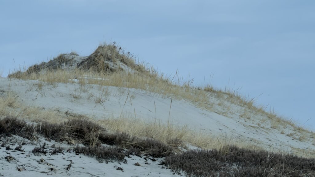
Open 360 Viewer Crane Beach Dune Trail Join me on this winter walk through the dunes of Crane beach in Ipswich, MA. This journey spawned as an attempt to spot a snowy owl. While we did not see any on our trip, maybe you will spot one in the 360 photos!    This being my first winter hike, I did not know what to expect. To our luck, the trail was well trodden. In only a few areas did my feet sink into the snow. The greatest depth was only 12 inches. Overall the walk was easy and the lack of wind made for a comfortable time.    During our journey we came across other hikers, as well as an eagle and some small birds. A deer was briefly spotted too. The dunes amongst the untouched snowscape provided an interesting visual contrast. A beach in the New England winter may not sound appealing to most. Many may be surprised with how good a time can still be had.  DCIMCamera01IMG_20260217_142920_00_042.ins Do you have a space you think I should check out? Or one that may be worth capturing in 360? I would love for you to share your suggestions in the comments or by messaging me below. 

Crane Beach Dune Trail – Winter Read More »

Week 7 2026: Video

Accomplishments Video Integration Rebuilt User Interface Bonus: Multi-Crop tool One of the paramount goals of virtual tour design is to immerse the viewer enough to suspend disbelief so that their mind may experience what it feels like to be somewhere else. These feelings are often the result of what is currently stimulating our senses mixed with our memories of similar stimuli. Many moments are still, like sitting in a kitchen or viewing a painting in a museum. These still moments often provide a simple stimulus to our sense of sight. Animated moments like walking through a forest or watching the waves on a beach give off strong stimuli to multiple senses. Imagine the whistle of wind through the trees or the touch of mist from a crashing wave. 360 video captures the life of a scene along with audio. Providing a seamless integration of 360 videos into tours can further engage the viewer with the experience and increase the overall impact. Video Integration UI With Media Controls UI Without Media Controls Getting 360 videos to play on their own is a simple process, with examples easily available. Integrating these videos with photo galleries and depthmapped images in a 3D space, however, came with challenges. Most examples display videos as their own scene. This decision creates conflicts when integrating them into 3D tours. In 3D scenes, images are depthmapped onto the space. This “paints” the photo onto a 3D model at an angle from where the camera is located, providing the optical illusion that you are inside the space. This comes at the cost of slightly more processing to place and stretch the image onto the 3D model. Since this only occurs once per photo, the performance impact is negligible. Videos, however, are a series of photos—sometimes 30 or 60 frames per second. The same negligible performance cost for a single photo grows massively when applied to video. Have you ever visited a website and had an unexpected video start playing? Surprises like this can make us uncomfortable. This discomfort puts us on alert and can negatively affect our feelings about an experience. Viewers should decide when a video plays. How can we play a video in a 3D space while still using it as a depthmap when navigating the scene, and also give the user agency over when it starts? The solution is to use both a photo and a video. We can export the first frame of a video and use that image for the depthmap. This way, a user can navigate to the scene and be met with a familiar experience. We can then add a toggle button that alters the user interface and loads the video. Since the image is the first frame of the video, the transition occurs seamlessly. The scene can then load the video without using depthmapping, avoiding the associated performance challenges. Rebuilt User Interface Up to this point, the user interface (UI) had been a series of modifications and Frankenstein-style enhancements to the default skin provided in the tool I use. To compound this, each tour type (Gallery, 2D, 3D) had its own skin with its own modifications. Every change I had made so far was quick and effective. The video integration toggle, however, came with a series of more complex changes and animations that broke that streak. The UI’s architecture was chaotic, included unused features, and was becoming bloated. This made it very difficult to add new features, especially since they needed to be implemented across multiple tour types. I have significantly grown my understanding of the framework and UI design since beginning this project. With this in mind, I decided to rebuild the UI. Visually, nothing changed outside of the new features. Under the hood, however, the code’s cognitive complexity has been drastically reduced. Actions have been separated into their own files, unused features have been removed, and configurability has been added. This configurability allows the same UI file to be used across different projects. Now, updates and maintenance can be performed on a single file, and the effects cascade to all related projects. Items in a visual display are often nested within other items, which are further nested within others. If one item changes, parent items may also change or resize depending on their relationship. This made it difficult to animate background resizing because it was a parent to the items within it. When the items inside changed size, the parent would immediately grow. By changing the layout architecture, it became far simpler to provide a dynamic display of media controls and animate the elements smoothly. Bonus: Multi-Crop Tool Social Platforms With 360 Support Multi-Crop Tool Support for 360 photos is consistently available across devices and web browsers. This makes it surprising that most major social platforms still lack support for it. Facebook supports both 360 photo and video, and YouTube supports video only. How can I share more immersive views within the confines of the tools available on other platforms? Instagram, Reddit, and other platforms often offer an image carousel. Within it, photos can be viewed one at a time and slide in from either direction. With correctly cropped photos, a rotating view can be emulated using these features. Because each photo is static, it becomes even more important to ensure each image is whole and that nothing critical to the composition is cut off. Splitting someone’s face across two photos, for example, may not be visually pleasing. I began brainstorming what the process would be to break a 360 photo into these cropped images. Many tools would allow me to manually crop, export, and reposition the images, but this seemed tedious, slow, and prone to error. If I miscalculated where the second or third crop should go, or was off by a pixel, the entire output would be affected. I decided the ideal solution would be one where every crop is immediately visible, and reframing one would automatically reframe all of them. I also determined that adjusting

Week 7 2026: Video Read More »

Week 6 2026: Maintenance

Accomplishments Preserving the User Experience Test List Documentation Workflow Documentation Bonus Architecture Update Infospot Annotations With time all things change, and so does our perspective. When developing features it is easy to become so immersed in the details and develop a sense that you’re aware of everything about the topic. With a head so buried in sand, we might forget the tide will soon come. It takes stepping away and changing topic in order to return with a fresh set of eyes to identify things that weren’t seen before. This week was a practice in that respect. I have identified and resolved many edge cases which lead to unexpected behavior within a virtual tour. These fixes don’t change the ideal user experience. Instead, they ensure that it will occur more often. To protect this experience I began collecting a list of tests to perform after changes. To better recreate these virtual experiences I have outlined the workflow and key steps required to deliver them. Preserving the User Experience Glitch, Bug, Error. These words have become synonymous with technology. The interesting thing about computers is that they almost always do exactly what they are told (if we don’t consider single-event upsets (Link https://en.wikipedia.org/wiki/Single-event_upset)). So really, glitches, bugs, and errors are results of misunderstood or incomplete expectations. For example, virtual tours can be viewed across desktop or mobile. When last week I added the option to right-click and drag the diorama view I had expected this to work the same on mobile. Then, to my surprise, using two fingers to drag on mobile appeared to “glitch”, only zooming in and out. Another step needed to be added which checked for two finger drag, not just right-click. Other improvements were added. In Click and Go 3D, when viewing the diorama, you can now double click on an area in the 3D model and it will determine the closest hotspot. Previously, you had to perfectly click on the tiny circle hotspots. This had the potential to cause frustration on mobile. The 3D cursor was hidden on mobile. It would appear where the phone was last tapped and just sit on the wall. I tested this using the tour from a tropical villa in Pattaya, Thailand. The cursor sticking to the wall reminded me of the geckos native to the resort. Sizing is a challenge I often face when defining user interfaces. The one file is expected to cover infinite sizes and many aspect ratios. How can we ensure text is equally visible on a screen regardless of resolution? We can scale the size of the values based on the screen’s size. This way it will always display as a percentage of the screen, rather than a static pixel count. I updated the custom grid to introduce font scaling, and reduce the chance of fonts appearing difficult to see. These along with more minor fixes and improvements were implemented and used to provide a better user experience as they navigate virtual tours. Test List Documentation Test List Many of us have visited a grocery store, purchased our ingredients, and only when we returned home realize we forgot something important. Lists are a great way to avoid this. I find that it’s easy to remember many things, but unlikely to remember everything always. This is why I began keeping a list of tests, or expectations, I have about the virtual tours I produce. When I change the code it’s important to return to these tests to check that I have everything the way I expect it. Sometimes one change, in one place, may affect something totally different in another place, in a way we would never expect. So as confident that I may be that my code is perfect, confidence is not fact, and lists are often more reliable. Workflow Documentation Simplified Workflow AI Graphic A recipe is another form of list. It’s a list of steps (sort of like a program (wink emoji)). Many of us have tried to follow a recipe from memory. Sometimes this leads to comments about how “it came out different this time”, or “did you use more sugar?”. Having a recipe ensures that something can be reproduced, and the closer we follow the recipe the more accurate the reproduction. Virtual tours are no different. You need ingredients (text content), kitchen tools (blender, camera, custom scripts), and an order of steps (take pictures before placing them in a 3D scene). All of this leads to a result. To keep providing results at a similar quality it’s important to have a recipe. So this week I organized and expanded upon some notes I have gathered about the process and documented them. This 4 page workflow document currently covers the steps from photography to upload for a single floor 3D virtual tour. I expect this document to change with time, as more outputs are defined, different needs are identified, and different improvements are made. Bonus: Architecture Updates Directory Structure AI Graphic When the power goes out, standalone devices require us to go around and reset their clocks. Each one we have to reset on its own. Computers almost never have to be reset nowadays. This is because the time isn’t always from inside the computer, it is checked from some shared location, and that makes life much easier. I wanted the same to be true for my virtual tours. Until now, virtual tours were self contained. They lived in their own folder, with their own plugins and other files. Recently I had to update a plugin file for all of the tours on my website. It was the same file, with one instance stored locally in each of the tours. It’s annoying to update one thing in six places. It’s much better to update six things in one place! This week I was able to dedicate some time to identifying if and how this could be done on a big scale. I wanted to outline a structure that would work for any

Week 6 2026: Maintenance Read More »

Week 5 2026: Communication

Accomplishments Diorama View Refresh Fix Copy Link Button Info Hotspot and Callout Research Multi-Lingual Support Virtual tours are tools used by people around the globe to send and receive information about places and possibilities. Interested viewers near and far may speak a variety of languages. Since virtual tours often take place within a 3D space, they do not always offer simple screen translations built into the web browser. Along with small features and improvements, a multi-lingual process has been developed. With it, viewers from near and far can better engage with virtual tours regardless of language familiarity. Diorama View Refresh Fix Diorama Incorrect Depthmap After Refresh An opportunity to improve the user’s experience was discovered when refreshing the browser while in the diorama view. Upon refresh the panorama and the location wouldn’t match, and could appear incredibly distorted. This wouldn’t fix itself until a hotspot was selected. Why was this? When a tour loads, a few steps are performed to determine how it should start. Deeplinking is reviewed. If it’s the first time a tour is opened, you will often start at the first scene. However, if the address used to go to the tour includes some parameters, like startscene or startlookat, it may use that information to locate a specific position and perspective within the tour. When the diorama view is part of that deep link it would confuse the player since it was not a standard scene or hotspot. This led to no 360 photo being projected on the 3D model, causing the whole scene to appear black. A change was made to determine the name of the scene, and if it matched the name of the diorama view scene it would instead reload the tour from the start. This would give the person who refreshed, or a viewer who received the link, a clean start to the tour. Copy Link Button Button with Tooltip Webpages, or iframes, visible within 360 tours are a great way to add extra context and functionality from anywhere on the web directly into a tour. Perhaps a user is researching which villa to stay at and would like to record a list of amenities. Perhaps a student is visiting a historical site in a tour for a paper and would like to use some information in their bibliography. Getting the link directly is great for records, favoriting sites, and offering a standard view to the external data. To support this, I added a button which copies the link to the user’s clipboard and can be immediately pasted elsewhere. Info Hotspot and Callout Research Mario 64 Jumping Info Hotspot with Callout orb on stalk behind wall A picture of the pyramids tells you they are old, but how old? A tour of a clothing store tells you what they sell, but how do you purchase it? This is where information hotspots come in. These are clickable buttons within the tour that do not move your position. Instead they are used to open a window or iframe to display information. Callouts offer a summary of information that appears before clicking the hotspot. This makes it less taxing on the viewer to know what the button may do before they choose to press it. How might info hotspots be implemented? What is the best workflow to generate them? These were among my many questions going in to offering this feature. I spent the better part of a day building a rudimentary example and devising a workflow. Info hotspots would be placed in Blender using PanoCamAdder, exported to an xml file, and from there updated with an image and features like opening a popup when clicked. This functionality was quick to produce. However, it is often difficult to perceive distance when viewing objects in unlit 3D space. How can we convey an orb’s location if it’s floating in the air? This was the same challenge faced by many video game companies during the 90s as they entered the 3D era. The solution was to always have the character connected to the ground in some way. In Super Mario 64 this was done with a shadow. To connect info hotspots to the floor, the “orb and stalk” approach was explored. Like a museum stanchion or a park plaque, the information sits atop a thin beam connecting it to the space. While drawing a simple line might seem sufficient, issues arise in multi-level environments. A hotspot on a second floor could visually pierce through the first floor’s ceiling. A raycast solution was considered but did not appear supported. A prototype instead defined the bottom position of the hotspot in Blender for use in the viewer. Before refining this approach further, focus shifted to callouts. Callouts visually appear next to a hotspot in 3D space. They can either be drawn in 3D or on the 2D viewport. Drawing them in 3D causes inconsistent text size based on distance, limiting design control. A 2D solution allows consistent sizing across desktop and mobile devices. While researching this approach, a similar tool was discovered in the krpano forums: the annotations plugin by kme. It featured orb-on-stalk hotspots with 2D callouts and customizable click behavior. The plugin met the defined requirements and provided an in-editor workflow, reducing complexity compared to generating data from Blender. One potential limitation is that orbs remain partially visible even when behind walls. With this tool identified, development on the custom solution was paused until the feasibility of final requirements can be confirmed. Multi-Lingual Support Language Popup Toolbar With Language Button Gallery Before Translation Gallery After Translation Communication happens in many ways. While pictures speak a thousand words, curated text can inform and guide a viewer with just a few. Many webpages offer multi-language display options, but virtual tours differ from standard websites and their text is not easily translated by browsers. This makes supporting multiple languages the responsibility of the tour software. Effective multi-lingual support requires that a user can change the language without being able to

Week 5 2026: Communication Read More »

Week 4 2026: Navigation

Accomplishments Street View Workflow Research Gallery View Update Refresh and Deeplinking Fix Book Now Button New Hotspot Icon and interaction Bonus: Click and Go 3D Hotspot off Fix Right Click to Drag Diorama Moving through a series of photos is a major feature that separates virtual tours from traditional photos. In virtual tours, you are spatially aware; you rotate your camera, click hotspots, or click a room directly from a diorama view. Compare this to traditional photo reels or galleries where images are viewed from only one angle, and navigation is limited to moving left or right. With this week’s improvements, navigating a virtual tour has grown more appealing, and sharing your perspective has become easier than before through deep linking. Google Street View Workflow Research Street View Nadir Blur Street View Backpack Street View Logo Multi-Floor Elevator Tool Blue Dots A popular tool with global understanding for virtual tours is Google Street View. While “Street” may be in the name, business interiors can also be uploaded to the platform. To consider offering this service, I first had to understand what goes into providing it. This research enlightened me to the complexities and challenges that come with generating and uploading 360 tours to Google’s Street View platform. First, let’s start with the outcomes. What can the tours look like? Google Street View offers three ways to display 360 panoramas. One is level-based, like the British Museum. Another is the familiar “Blue Line” tour that appears on streets and hiking trails, such as Mt. Wakakusa in Nara. Lastly, there are the “Blue Dots” which show a single image, like those you might find around Doi Suthep in Chiang Mai. Uploading individual images for the blue dot outcome is fairly simple, though the results offer only one perspective per dot. Blue Lines and connected tours are more complex to upload. Google offers two ways to upload tours for free. They have the Google Street View Studio, which can only make Blue Line Tours (no connected/elevator feature), and requires the upload to be in a video format. Google also offers many free APIs. These require precise steps to be manually programmed in order to upload content to the platform. Third parties have stepped in to assist and simplify calling the APIs, though this comes at a price. Today, platforms exist which charge a small fee per upload, or a higher fee for a one-time license. Beyond calling the APIs, these tools offer a visual user interface and features that help prepare the data to ensure the output will be as expected. When uploading to Google, it makes many of the decisions about your tour. For Blue lines, Google decides which photos to strip from the videos to use. For connected tours, Google decides where to place the hotspots based on GPS and compass data. The photos or video uploaded to Google must meet specific criteria in order to get a desired outcome. For instance, all photos must include GPS data. Each photo must be 3-5 meters apart (10-15 ft). Otherwise, the tour may end up as a variety of blue dots with no navigation hotspots at all. All photos must also include heading, or compass, data which identifies where north is. These requirements alone complicate much of the workflow. Many 360 cameras do not include GPS or compass abilities. Cell phones assist with the GPS data, though if the cell phone is not directly under the camera, the GPS data will be feet away, or with the photographer hidden in the next room. This is where manual effort must be made to correct the GPS data, and where many of the third-party tools find their usefulness. Setting the heading must also be done manually. While tools like the Insta360 GPS remote can offer compass heading, it only offers this feature in an overlay during video shoots, not photo mode. So, north directions must be manually added after the fact. For smaller buildings, this may not be too time-consuming, especially if the phone stays with the camera. If the camera is always facing the same direction, north can likely be set with one update via batch process. However, this process does not appear to scale for larger shoots. The phone’s GPS data is only so accurate, so quality assurance must always be done to ensure that rooms and hotspots appear in the correct location. Additionally, common compasses may encounter interference, or attempts to keep a camera in the same direction may diverge over dozens or hundreds of shots. This would be especially hard to manage if you had multiple photographers shooting simultaneously. Taking photos in open spaces comes with its own challenge of hiding the photographer. Homes and apartments are simple, as the camera person can step away into another room. At a park or in a warehouse, this may prove cumbersome and time-consuming. One solution is to take multiple photos with the person in different positions and perform a crop. This may be acceptable in some instances where the images can be far apart. It is less acceptable when you need to take every photo 10-15 ft apart. This greatly expands time on location and time editing. If an automated way to remove the photographer can be found in a single photo, this will no longer be a problem. I questioned how Google Street View has so successfully hidden the photographer from their hiking trail Blue Line tours. Their equipment appears to solve the time taken and hiding the photographer at the sake of quality. The Google team creating these tours appears to wear a backpack. Most likely, this captures images every few steps. This means someone with the backpack could take a leisurely hike with images snapping automatically along the way. Compare this to my proposed workflow of walking 10ft, taking two photos, then moving the camera again. Since the human is carrying the camera and is close to the lenses, they must be hidden automatically. The process appears to stretch

Week 4 2026: Navigation Read More »

Week 3 2026: Accessory Information

Accomplishments: Drone Hotspots Information iFrames Hotspots Brand Watermarks Bonus: Click to walk 360 Tour Click to walk 3D Tour 3D Cursor Workflows 360 Tours capture a moment in time for the viewer to visibly immerse themselves in. Information like touch, and historical significance, may not be easily conveyed by 360 photography alone. With accessory information, like branding, iframes, and drone views, the user can take their understanding beyond first person, with a birds eye view, and supplemental details. And when they are ready, they can now turn interest into action with the ability to book and purchase from within the tour. Drone Hotspots Drone icon Drone Shot Drone shots can provide views of a space unlike most have ever seen. Viewers can see the plot layout, the landscapes near and far, and so much more. What makes it so amazing is the same thing that makes it abnormal. Walking through a tour, you often click on a hotspot, and your expectation is to transition to that space on the floor. When you enter a drone hotspot, you will be clicking the sky, which is much different from the floor. How do you convey that? To showcase the difference in transition, I went through a variety of considerations. Birds, eyes, skylines, and more. None seemed to intuitively convey the transition in all cases. Not every drone shot will be near a city, eyes are already used as a button to show and hide, and birds don’t hover, they soar. I decided to create a simple icon for a quad-rotor drone. These have become a standard with drones, have grown in popularity, and appear unlikely to be mistaken as another feature. Information iFrames Hotspots Rose Kennedy Greenway Before and After Html iframe example Virtual tours excel at providing spatial information in an immersive way to the viewer. Sometimes it’s important to convey specific details about a space which aren’t easily conveyed visually. For instance, Boston’s Rose Kennedy Greenway includes a plaque. A tourist wouldn’t immediately be aware that the space used to be a concrete overpass. With a placard, they can learn about the history, including the time, effort, and frustration it took to change the place in such a way. With information hotspots, we can share any information directly within the tour. Information hotspots open a window within the tour. It works like an iFrame on other websites. iFrames let you put another webpage, within a window, or “frame”, in your webpage. This gives us the ability to make custom information cards with HTML, or link any existing webpage. This flexibility gives the feature the opportunity to satisfy many needs, from historical placards to space details like operation hours, and even opportunities to convert interest to action by linking conversion or purchase pages right into the tour. This feature was added into a tour by creating a new icon and hotspot style for the user to see. When the user interacts with this, it relies on a new iframe_popup plugin I created. This plugin takes control of the scene, blurring the background and disabling controls to bring focus to the iframe. The iframe can link to either a local folder with tour-specific HTML files, or separate webpages. Brand Watermarks Brand Watermark If a user is browsing multiple tours, or trying to remember where the current tour is from, some level of brand identity can be helpful. This reminds the user who the tour relates to and helps the business reinforce its presence. I added a new section to the tour display that allows a brand image to be included. This is customizable from the tour.xml and can be set to different levels of transparency to balance visibility with its effect on immersion. It can also be optionally hidden when the toolbar or hotspots are toggled. Bonus: Click to Walk 360 Tour When navigating a 360 tour, you may not always want to click directly on the hotspots. It can get frustrating to click close and not receive a response. This goes along with the recent feature of hiding hotspots. Repeatedly hiding and unhiding hotspots when moving between rooms can grow cumbersome. What if you could click in some direction and go there? I came across an existing plugin by LastRomantik which does just this for standard 360 tours. I tested this plugin against an example tour, and when enabled it does a good job at navigating to the nearest hotspot when the user double-clicks, regardless of the hotspot’s visibility. Bonus: Click to Walk 3D Tour When navigating a tour, 2D or 3D, it can be annoying when nothing happens when you click. Responsiveness is important for any user experience. How can we better navigate 3D tours and inform the user when there are no more locations in a certain direction? We can use a Click and Go workflow, similar to the one mentioned above. I began creating a custom plugin that works for 3D scenes. 3D scenes come with more challenges than their 2D alternatives. When the user double-clicks, it draws a line, or casts out a ray, from the camera through the mouse and the scene. It then determines which hotspots are closest to the ray. If the user double-clicks a wall or a ceiling, there may be a hotspot behind it. It’s unnatural to teleport through walls and ceilings, so these hotspots must be ignored. This proved surprisingly challenging. Through trial and error, I was unable to accurately test for hits of the ray and the 3D model in the scene. After stepping away, I considered other examples or features that may already solve this problem. I found an example where a 3D cursor is implemented in KRPANO. This is an image which follows your mouse while clamped onto the 3D model. After reviewing this logic, I was able to properly hit test the 3D model and begin ignoring hotspots that are not visible to the user. This provides a better experience with fewer breaks in immersion. I

Week 3 2026: Accessory Information Read More »

Week 2 2026: 3D Visualization for Multi-Floor Tours

Accomplishments: KRPano Multi-Floor Implementation Tested Retopology Workflow against Dense Multi-Floor Tour Bonus: Created Customizable Image Gallery Plugin Single-floor 3D visualizations are easy. You look down from the top and can see the entire floorplan. But buildings with exteriors or multiple floors introduce new challenges. This week, I began tackling questions and user experience (UX) challenges related to navigating and using a 3D visualization for a multi-floor building. Large buildings especially benefit from 3D visualization. If you want to see the third floor, it can be as simple as moving your eyes to that level and finding the room you want. The alternatives are walking there room by room in a 2D tour or navigating menus to find the correct floor and room. A successful multi-floor visualization requires both an efficient workflow for building the 3D model and an intuitive user experience for navigating and selecting parts of it. This week, I adjusted my 360 workflow to conform to the needs of multi-level spaces. The current process runs into some hardware limitations, and further improvements will be required to fully support these tasks. Began Implementing Multi-Floor Tour Features in KRPano Exterior On Floor 1 Selected Floor 2 Selected I wanted to ensure that the 360 tour tool I use could support the needs of multi-floor 3D visualizations. I created a simple two-floor example that included both floors, a building exterior, and a dome object representing the surrounding ground. The dome is always visible so that when someone views a floor, they can understand its position relative to the outside using landmarks. The exterior can be toggled on or off. This allows the viewer to see the building like a snow globe if they choose. Interior floors are selectable, and when one floor is selected, all other floors become transparent. This prevents upper floors from blocking the view when looking inside or selecting a hotspot for navigation. A key challenge was balancing the ability to select higher floors to change the floor of interest while also being able to ignore them when clicking on interior objects. The solution was to dynamically adjust the transparency and selectability of floors based on the viewer’s angle. Most navigation hotspots exist on horizontal surfaces and are more visible from higher angles, while floors themselves are clearer from lower, horizontal views. This proof of concept was successful. The 360 tour can manage all of these needs, and I believe this approach has strong potential for an intuitive user experience. Tested Workflow Against a Heavy Scan Phone Scans Phone Scans Density Remade Model Layout Remade Model Textured Remade Model Density I tested my 3D visualization workflow using the data from the Supalai Place 360 tour. This tour is very dense, with over 100 photos. If you are familiar with the layout, navigating through locations is quick. If not, learning the space through clicking can become cumbersome. A gallery view exists, showing a grid of images organized by floor and room, but even this becomes unwieldy with such a large number of photos and limited categorization. Creating the 3D model took considerable time, but it provided an opportunity to practice my 3D modeling skills. Using Blender, I merged connected vertices automatically and created clean topology, avoiding N-gons through loop cuts and other tools. Once the models for each floor were complete and textured using the 360 photos, I performed a process called baking. Baking extracts the relevant portions of each 360 image and merges them into a single texture map. While normally straightforward, baking more than 100 high-resolution 360 images proved extremely demanding on hardware. Although the JPG image folder was only 4GB, the system used 24GB of GPU memory and 64GB of system memory. This is because JPG files are compressed and expand significantly when loaded into memory. This exhausted system resources and caused Blender and Windows to crash. One positive takeaway was realizing the benefit of using JPG for final output instead of PNG. Transparency has not been critical, and switching to JPG can reduce bandwidth and hosting storage usage by roughly 85%. This process highlighted several lessons. Manual retopology by cutting and extruding floors is time-consuming and scales poorly with project density. Other tools, such as Polycam’s 3D floorplan mode, exist but struggle with elevation changes and curved spaces. I plan to research alternative approaches, such as blocking out layouts with simple primitives. For panorama importing and texturing, breaking the workflow into room-by-room steps may help. Applying textures incrementally and combining meshes per floor afterward should reduce memory usage and simplify the baking process. I also learned that a usable exterior mesh may not be possible without sufficient exterior coverage. Balcony photos were often taken at angles too steep to properly capture the building façade, resulting in distorted textures. Drone imagery may be required to fully support this feature. Bonus: Created Responsive Grid Other Gallery View New Gallery View When a 360 tour is very dense and lacks a 3D visualization, a gallery view can be beneficial. This also applies to standalone 360 galleries, such as my projects from Japan and Thailand. While adding a gallery view to the Supalai Place tour, I noticed that the existing tool presents all content at once, which may feel overwhelming to some users. I decided to create a new gallery tool with a user experience more aligned with my expectations. Dropdown tabs allow viewers to quickly see available sections before diving into detailed options. I also centered the content on the screen so that users on wide displays can view everything comfortably without excessive head movement. Additional optional design features include single-column layouts that slide in from the side. Overall, the use of tabs and centered content provides a strong experience for navigating dense 360 galleries and offers a practical alternative when a 3D visualization is not available. Summary My current workflow for 3D visualizations works well for single-floor, small-scale spaces but does not yet scale to multi-level, room-dense locations. These exercises helped identify the research paths needed

Week 2 2026: 3D Visualization for Multi-Floor Tours Read More »

Week 1 2026: Efficiency

Accomplishments: Automated Tripod Removal Automated Hotspot Image Adding in Blender Automated Depthmap Tag Translation from Blender to Tour file. Automated Tour File Encryption Bonus: Added button to hide all hotspots in tour 360 tour creation requires manual touch-ups and information for each scene or photo used. This is no big deal for a small room, but for a home with over 100 photos it will take forever. I would rather spend time on new features or new tours. To be more efficient, I programmed four new tools that save me hours when making tours. Automated Tripod Removal Original Bottom Blur Bottom Automated Inpaint Incorrect Manual Inpaint Logo Replacement Tripods in 3D visual 360 photos capture everything, even what’s below them. Modern cameras like the Insta360 series do a fantastic job at removing the tripod pole, which is almost always invisible. The feet are another story. They stick out. While my tripod’s feet are quite small, they appear in every photo. Especially in Virtual Reality (VR), this perception can take the user out of the experience, reminding them they are in a photo. When creating 3D visualizations, these photos are projected onto the space, and the tripod feet get scattered across the floor. Solutions exist that are successful in hiding the tripod. Insta360 offers a tool to hide the space with a logo or picture. You can blur an entire circle of the space, or manually inpaint the area using a tool like Affinity Designer. However, hiding the space with a logo or blur reminds the viewer they are in a photo and breaks immersion. Inpainting works wonderfully, but it’s manual and unacceptable for hundreds of photos. I wanted an automated solution that seamlessly erases the tripod feet as if they were never there. This preserves user immersion and saves hours of manual photo editing. Using ComfyUI’s node editor and an AI image generation model, I programmed an automated solution that removes the tripod feet with an over 85% acceptance rate. The tool takes a folder of images and, for each image, looks only at the bottom. It cuts out a circle where the tripod is expected to be and uses AI to guess what should be there. An 85% success rate is already great and has saved me hours of manual editing. In the future, better models or training a custom model to detect and remove tripod feet could push this number even higher. This experience taught me how to use ComfyUI’s node editor to automate and manipulate 360 images, as well as how to use live projection mode in Affinity Designer for quick manual touch-ups like removing tripods or reflections. Hotspot Adding in Blender When creating 3D visualizations, I use a tool called Blender. This is where I decide how all of the photos fit next to each other. A manual step is required to add the circular “hotspot” that you click to move to another photo. For small tours, this process goes quickly. For large tours with 100 or more images, the time can become unreasonably long. Blender allows scripting using Python. The tool I use to add 360 photos in 3D, called PanoCamAdder+, is written in Python and exposes functionality that can be accessed programmatically. The tool I created lets me pick the image I want for a hotspot. It then checks the unique name assigned to every 360 photo in the scene and uses PanoCamAdder+ to generate a hotspot image for each one. What once took an hour now happens in seconds with the push of a button. Automating Depthmap Tags in tour.xml PCA Depthmap Tour Depthmap To show 3D visualizations, the 360 tour software needs to know how to display the space and where each 360 photo exists within it. This requires taking the locations of the photos from Blender and placing them into a file used by the tour. This is not a simple copy-and-paste process. The data from Blender must be written in a specific and organized format. Manually doing this takes time and increases the chance of misclicks or typos, which costs even more time. I wrote a Python tool to handle these repeatable steps. It takes the data output from Blender and PanoCamAdder+, reads the target file, and inserts the information in the correct locations. Within seconds, I can now apply all location information to every 360 photo with no manual intervention. Encrypting All Tour Files Tour File in Dev Tools When a 360 tour loads in a browser, the code and related files are downloaded to the user’s device. If a client pays for custom features or if you want to protect your work, encryption makes it more difficult for someone to inspect and reuse that code. JavaScript and XML encryption is inherently limited because files must be decrypted to run. It’s similar to a locked gate: it doesn’t make theft impossible, but it reduces opportunities. A typical 360 tour can load dozens of files. Encrypting them individually is easy, but it increases the risk of forgetting a critical file. Using Python, I wrote a script that scans the tour project folder and automatically encrypts every supported file using the existing encryption tool. While this doesn’t save much manual time, it provides peace of mind by ensuring that all files are protected consistently. Bonus: Hide All Hotspots Button Hotspot Overlap Immersion has been on my mind lately. When someone enters a virtual space, they imagine what it feels like to be there. Our minds quickly notice what doesn’t belong. If a room is full of white circles overlapping tables or doorframes, it becomes harder to maintain the illusion. I added a feature that allows users to hide all hotspots with a single click. This lets them immerse themselves more fully in the environment and view the entire 360 photo without navigation elements getting in the way. Summary The new year is off to a great start. I’m curious how much time I’ll save thanks to the effort put into

Week 1 2026: Efficiency Read More »

Recent Post

  • All Post
  • Immersive Media
  • Photography
  • Software Development
  • Travel
  • Web Design
  • Week Reviews

© 2025 Justin Codair