Accomplishments
- Caching
- Smart Bind Mounts
- Project Based Processing
- Improved Coarse Matching
Bonus
- UI Design
- UI Implementation
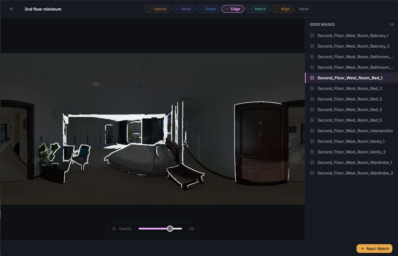
- Manual Adjustments
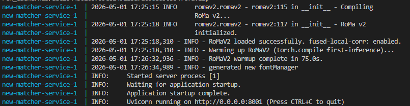
The time it takes to test a new feature can be substantial. In previous weeks we’ve seen single runs of a service take over 17 minutes, and get brought down to under 2. This week I looked for more opportunities to reduce time between attempts and completion. Through this process I was able to save substantial time building through caching and clever docker ordering. I was able to save time between datasets by preserving previous runs as projects. And during this search I was able to find an alternative tool that performed even stronger with my dataset for the same time.
With improved development speeds across the board I was able to design, implement, and validate a user interface (UI) for this tool all within the same week. This UI further improves my ability to test features through project management and monitoring. What weeks ago took an hour of manual copy, paste, and wait, now takes just a few clicks and moments.
Caching
Caching allows us to take work that was completed once before, and use it again. Our phones save our passwords, and save us time logging into sites. Imagine if instead, we had to fill out a captcha and come up with a new one every time. It’s better just to remember it, or let our phones do the work. I did this by caching the compiled torch, and changing the order for how docker copies the large (3+GB) AI models used in this project.
Torch is a tool used in operating AI models. This tool is written generically, and can be applied across many different hardware devices. Often when it’s applied, it gets compiled. This means that the generic tool is broken down and translated to run a specific way for that hardware. This tool is multiple gigabytes (GB), so compiling this tool every time for the same hardware is very wasteful. I set up a cache and check system. After compilation it saves the information, then the next time the container is built it checks if there is a saved version, and if so, if it works for the current hardware. If yes, it loads that instead of compiling it again, saving seconds to minutes depending on the build.
Another trick I learned relates to the way docker “layers” an image. Docker takes a variety of information and prepares it in a way that it can be run on any hardware using docker. In this process it stacks layers of information on top of each other. When building a docker image, it checks the previous image to see what layers changed. If it finds the lowest layer that changed, it rebuilds everything above it. Up until now, my large AI models appeared in the later docker layers. This means that just changing a single word in a log statement could take minutes to rebuild and test! To fix this, I moved the docker images up in the process.
Smart Bind Mounts
A smaller trick I employed is something called a “bind mount”. This hooks an existing docker container directly into the repository open in my code editor. This allows for certain files to be immediately available to the container upon saving, and further improves speed.
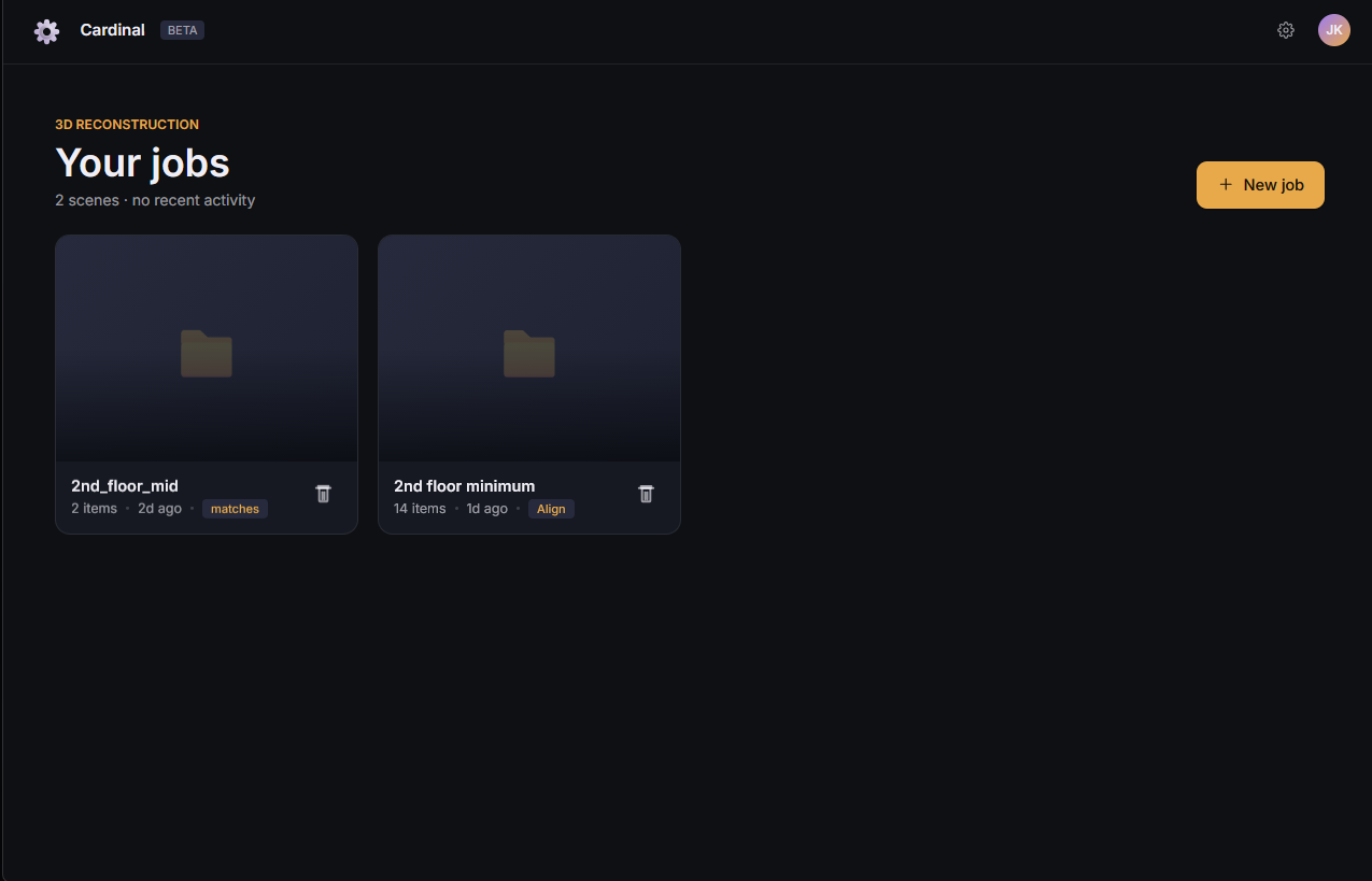
Project Based Processing
A notable quality of life improvement for this week is certainly project based processing. Previously I would only work with one dataset at a time. Running it through the long processes and verifying output. Afterwards I would need to erase all of the data, and revert back to square one in order to run a different dataset. This week that all changed.
With a major refactor of every service, I was able to store and retrieve data within subdirectories linked to the specific project. This keeps data separate, and allows me to pick and choose what dataset I want to work with without removing any data. This preserves each unit of work completed up to this point per project. It also allows for more consistent results, as small changes between runs can be difficult to pinpoint when all previous steps had to be repeated.
Improved Coarse Matching
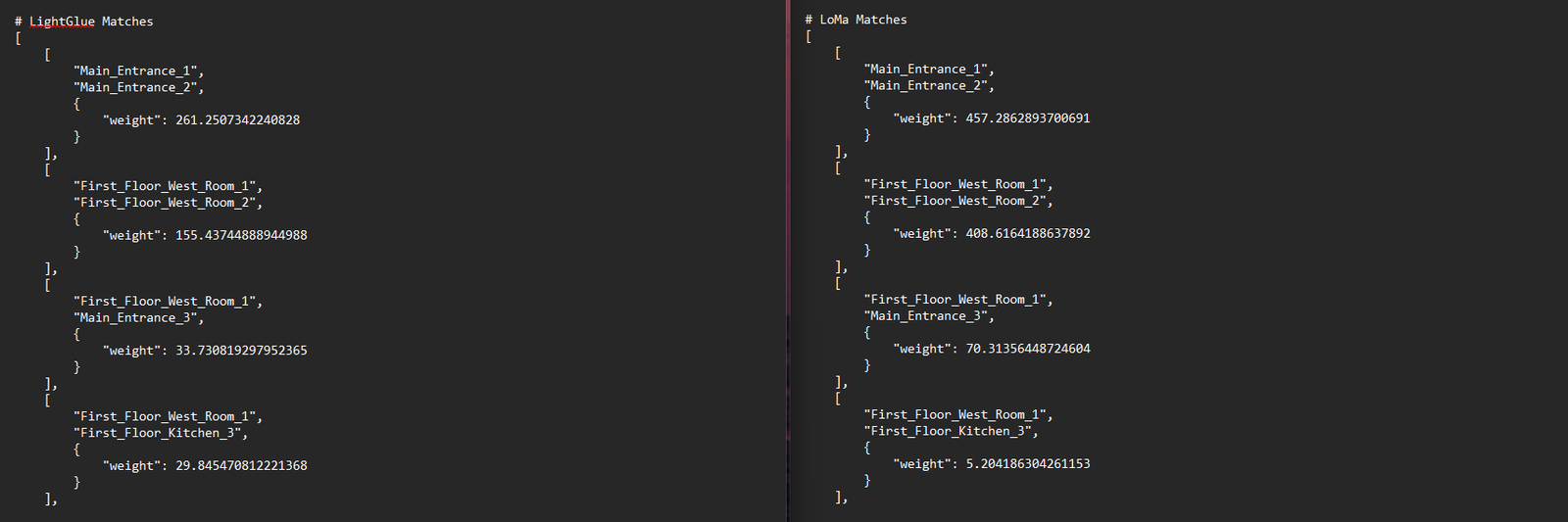
While searching for alternative options to reduce the speed of the slowest service (matching), I came across the LoMa tool. An incredibly recent tool aimed at providing high quality matching across images at a speed comparable to LightGlue. This alone enticed me to try.
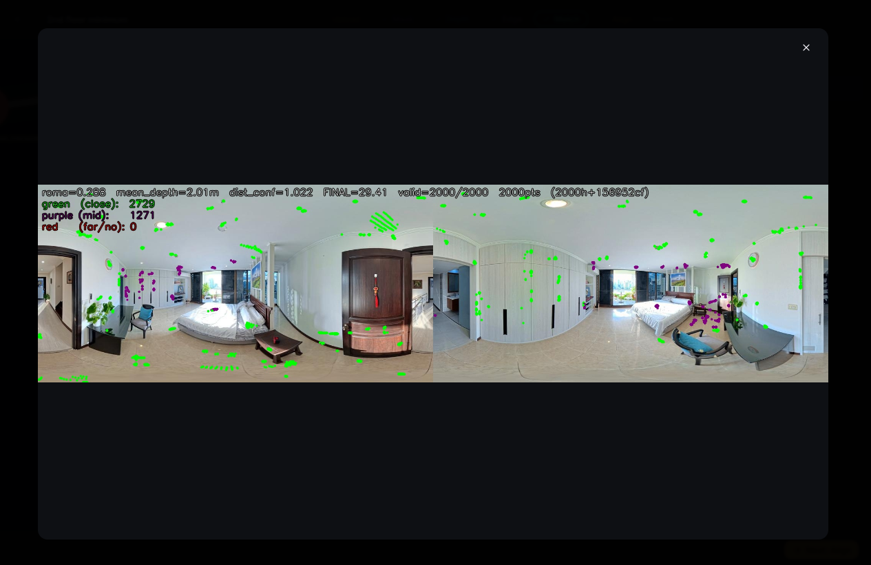
With a quick implementation I was able to test a LightGlue replacement and to my surprise saw confidence levels during the coarse phase drastically improve. Close rooms appeared closer, and far rooms appeared further. This gave me confidence that it would improve the quality of top matches being fed into the fine matching stage. The times appeared nearly identical, so I chose to swap out for this new tool that appears to better fit the current use case.
Note: Non-determinism
While testing coarse matching I began to notice something interesting in the matching process as a whole. It appeared inconsistent. Run to run I would notice slight changes to the confidence scores. Previously I had believed this to be a result of my changes, though now it appeared to happen even without my intervention.
I noticed that quite a few steps during this phase seemed to produce random, non-deterministic results. Non-determinism means that the results cannot be consistently determined. They vary, and may deviate slightly through each iteration. This quality occurred throughout the process. Spherical RANSAC was changing slightly, the distribution of points had potential to, and most of all the LoMa and RoMa passes. I found solutions to achieve determinism within these steps. Some of them, like the ones in RANSAC, I applied. However, the changes necessary to add determinism to LoMa and RoMa drastically reduce the speed.
I contemplated if the speed adjustment was worth it for the benefits of a more consistent pipeline. Currently the pipeline is incredibly consistent. I only ever notice topology changes within the range of 0.5% confidence score. That’s incredibly small! So I considered my options. I could add determinism, take the substantial (minutes!) time penalty, and know definitively when the wrong, incredibly similar, pairs are being matched. Or, I can take this as a symptom of another challenge. If images are being mixed up within half a percent, we need to make the strong images stronger. We already use distance to assist in this. Perhaps other options are available that can more semantically review two images for similarity.
I made the decision to go with the second option. The time penalty does not seem worth it for the minor reward, and it does not solve the current problem definitively. I will continue to review options and seek a way to better improve matching beyond the point that non-determinism can impact it.
Bonus: UI Design
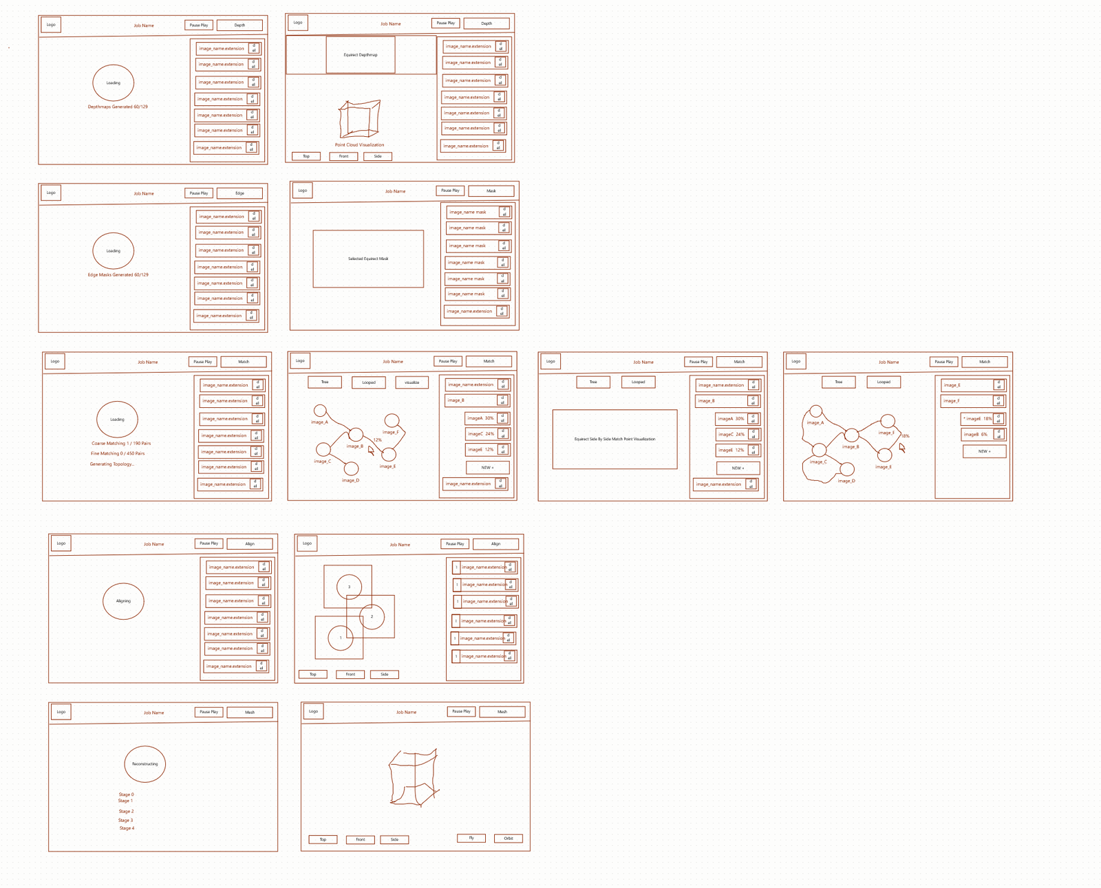
It’s always helpful to draft ideas before spending the time to implement them as this helps identify problems early and gives space to solve them. By creating mockups we can do this for our user interface. This practice helped us improve the user experience (UX) and identify ways to improve before we started.
My process to design a UI often starts with writing out a list of requirements, or things I would like the tool to do. Then I group the requirements by what pages I believe make the most sense to host those features. Then I will sketch out the ideas on paper, and move to designing in a tool like Figma.
Recently I became aware of Anthropic’s new tool Claude Design. I had been testing out Claude’s subscription service and decided to give this a shot. The weekly tokens warranted by my plan were exactly enough to complete my user interface, and the features to do it were quite interesting.
I began by using the napkin sketchpad. Here I used primitive shapes and a pencil to outline toolbars, buttons, and where visualizations should go. This felt clunky and limited at first, as I am used to sophisticated tools with grouping, frames, and components. I came to the realization that those tools are better for defining every last detail of a mockup from the start. In the moment I value speed and feasibility much more, which AI design tools like this aim to provide. And for speed what is better than two shapes and a pencil? So I wrote away, quickly blocking out the concepts for a few views I defined.
I iterated, drawing a few views, then using the chat tool to prompt the AI to take those crude images and draft them into usable wireframes. I repeated this every few frames until I had the available views completed. A few redos were necessary, where it seemed to ignore part of my drawing, or part of my prompt. And at some points it became inconsistent between views, which I quickly pointed out. There is still very much review needed with these AI tools. However, even with review, the product I was able to generate in minutes with this tool likely would’ve taken hours using Figma. If tools like this could learn to separate components, and group and layer, and export to a more detailed tool like Figma, that may provide the best of both worlds.
Once the wireframe was complete I prompted again to convert it into a visual mockup. This gave style to the wireframe, and offered me the ability to click through the tool. Having a meaningful mockup in such a short amount of time genuinely gives a great opportunity to see fleshed out ideas before much time is spent to create them.
I intended to keep my design simple, and consistent. I wanted to follow the steps I’ve defined in the backend for simplicity while I am debugging. So I focused on 3 sections. A top bar that tracks where you are, a left bar that supports visualizations, and a right bar that supports components of the stage. And sometimes modal popups appear for additional visualization.
I am happy with the design. I can now much more quickly navigate the variety of debug information available while also beginning to see the simpler, finalized workflow.
Bonus: UI Implementation
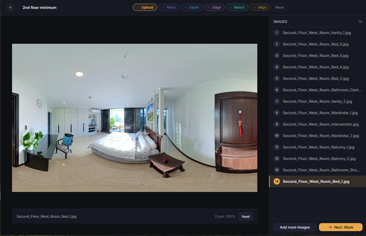

To implement the UI required a generous amount of refactoring for every single service. With the speed improvements performed over the last few weeks I felt that I had the time to begin this implementation and testing. And further, I was eager to have a manual solution available for mismatch edge cases caused by the non-determinism. With the time, and reason, I began to work.
The mockups available made the work much easier. From the outset I knew what items would be repeated across pages, and what tools would need to be built. I went page by page, and service by service, creating the frontend, and connecting the services to them. This took a long time, and luckily I was able to finish it all within the week. It especially felt good to no longer dread restarting a service with a large model. Now, I knew it would be done very quickly and ready to test.
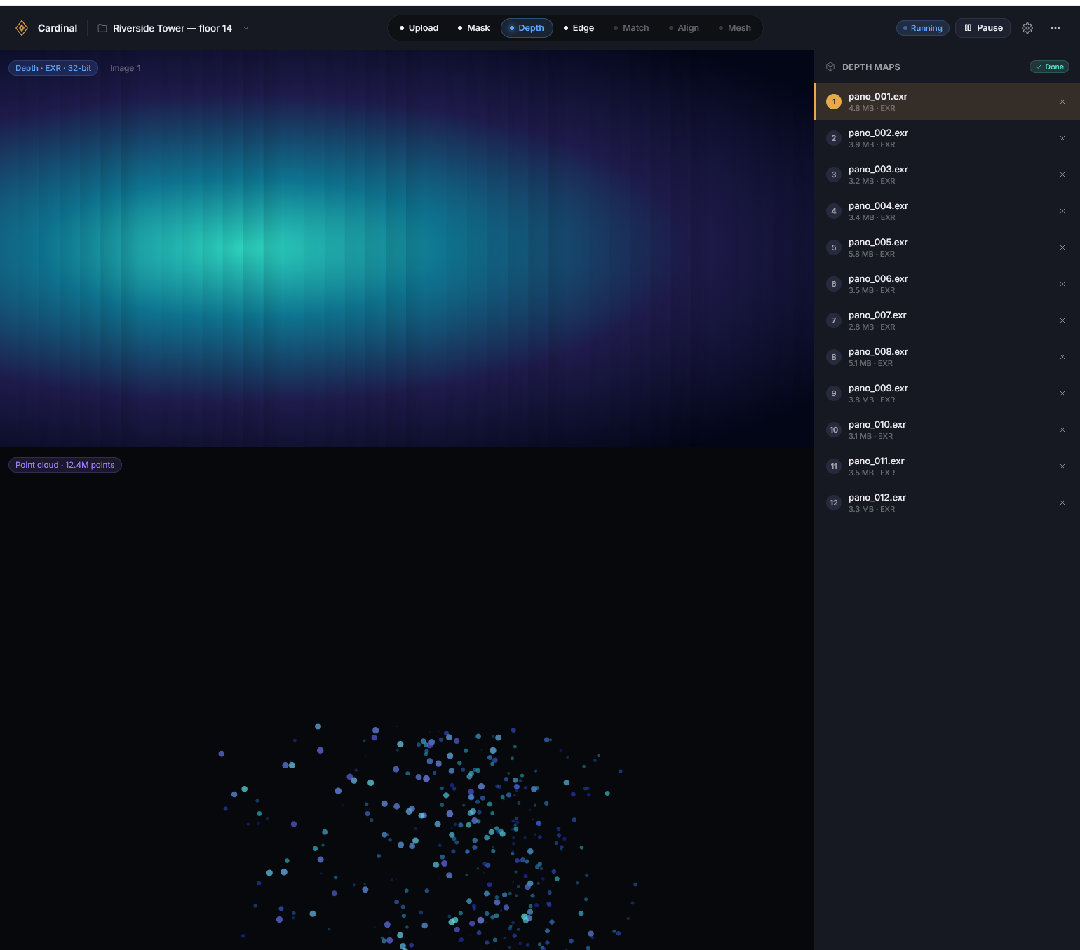
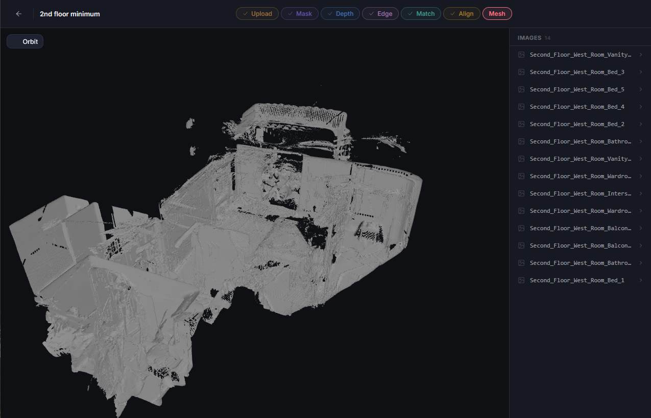
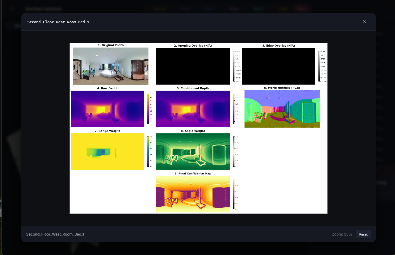
Each stage came with it a determination boost. It felt like opening a present, clicking through the screens, and seeing previous and new visualizations right in my web browser, and with just a click. Previously each stage took a variety of steps to process and visualize. I had been working mostly from a notepad file with a variety of commands to send through a terminal. Now those commands are embedded in buttons and pages. Much less error prone. And to view the content I would need to navigate to the folder within docker desktop, download the files individually, and open them in a viewer. For 1 image this is trivial. For many images, finding the correct folder in a nested sea of folders can be more cumbersome. For opening a series of aligned point clouds, it could take minutes to download each one, open them in Blender, and update the point clouds to display with color. The UI itself is an additional time saver implemented this week.
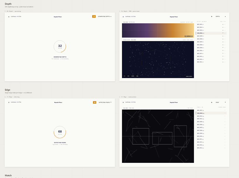
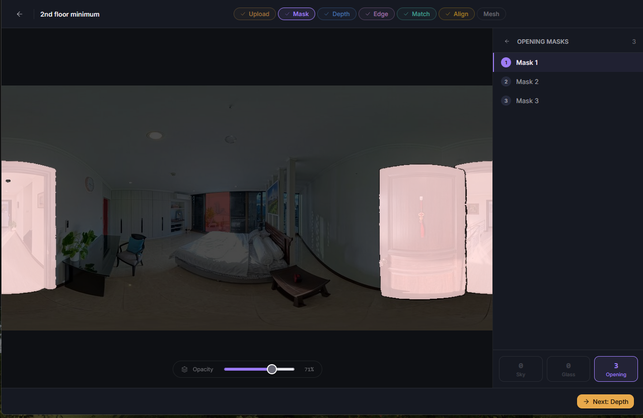
Visualizations too have become more intuitive and interactive. Previously, if I wanted to review a depth map’s point cloud, I would have to run the service to that point, open docker, download the file, open it in Blender, and apply the colorization to the point cloud. Now, I load the depth page, and click the file I want to see. It just works. Some are more interactive, like mask visualizations including a slider.
Bonus: Manual Adjustments
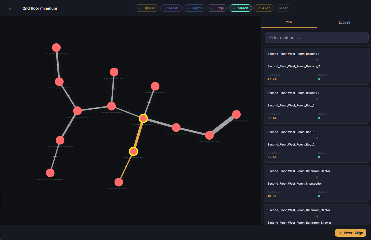
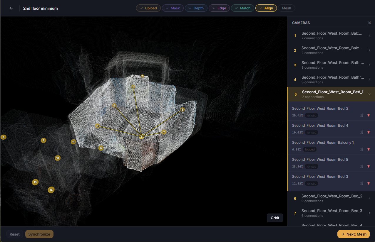
Sometimes small changes could be made to save a dataset from needing to be rerun. These often include updating the matches, or editing an aligned point cloud. When quick fixes are needed, manual adjustments are now available for the match and align steps.
Using the visual topology viewer tool I can now select, delete, and reconnect nodes instantly. This lets me influence control over the tree, including being able to resolve those 0.5% variances resulting from non-determined output. I can also fix misalignments. Say a balcony was positioned too low, or two opposite rooms were overlapped, I can drag the misplaced point cloud, rotate it, and save it at its proper location.
Summary
With more speed often comes more throughput. This week seems to be a good example of that. As I continue to make improvements to the process and identify ways to better develop, I am able to develop more. Through more iteration comes more perspective and refinement. Through this perspective and refinement I continue to develop a better experience. Just six weeks ago I displayed a proof of concept of two images constructing one mesh from a slew of scripts managed by a terminal. And now, I have a repeatable process, that can pose many cameras, store the information, edit it, and iterate upon all tools used to provide it, with minimal friction, and an interactive user interface.